
Edited to add: This is off-topic again, and I'm sorry for that. Especially for those that subscribe to my feed. It's probably posts like these that make you unsubscribe. But I wanted to apologize to anyone who may have tried to post a comment between 6PM and 7:30PM (Central time). When I was uploading the new template, my comments were down because this new template doesn't recognize embedded comments. So I had to switch over to pop-up comments. I know a few of you will be happy that I said goodbye to embedded comments! The only thing that got lost in the switching of the templates was the ongoing poll I had. Oh well. I can always create a new one!
Furthermore...I am so so so so happy that this little article was telling the truth! It works! It really does. I've been afraid to change templates for fear of losing my widgets. But reading that article inspired me to be brave and go for it!
When browsing through backgrounds I kept a few things in mind. I wanted it to work with my current header. Because I don't want the trouble of creating a new one based around a new background that I would most likely want to be changing again in four to six months. So that was my first and only rule really. All of these work with the current header. Some maybe a tad bit better than others.

Black/White/Red Flower--Option A
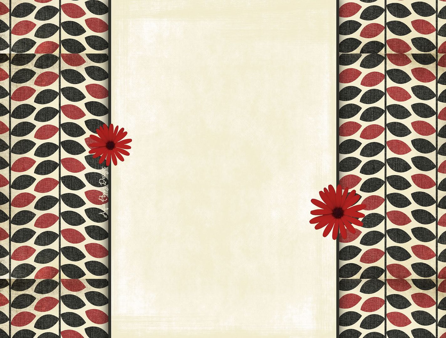 Tan/Red and Black Leaves/Red Flowers -- Option B
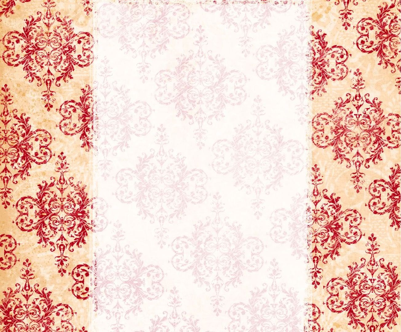 Tan/Red -- Option C
Cheery Chat/ Current Template --Option D
 Cross-stich tree -- Option E
 Blossom--Pink Flowers -- Option F
Do you have any that you absolutely positively hate? Do you have a top two?
© Becky Laney of Becky's Book Reviews
If you're reading this post on another site, or another feed, the content has been stolen.
20 comments:
I like A and C....but I also really like the one you have now. :)
My first choice (if you have to change) would be A. Second choice would be C. I actually probably like your current background better than either of those. My least favorites are B and F.
Good luck with the decision, I know it can be hard!
First choice is C hands down. E would be my second choice, but I really, really like C. My least favorite is F, especially since it clashes with your beautiful header.
I like the cross stitch tree myself... and the tan/red option. I like this background but I'm not a huge fan of black backgrounds. Still, I'd read this blog. :-)
I really love E! I also like C and A a lot. My least favourite is probably F, but I don't dislike it...just like the others better :P
I like the one you have now! It's so pretty! But, I know how it is - sometimes you just want something different. If you feel you have to change it, I like A the best. However, it looks like you'd have to change your fonts from white to a color. Not sure how much of a pain that is!
I think Option C is far and away the best
Thank you for your opinions everyone!
I like C myself. The paintings say it all, no need for extras, they'd just detract I think. Have fun deciding.
I really really loved option E and like option A almost as much. Option E is beautiful though!
Thanks for your opinions everyone. It looks like C is favorite so far. With A and E being next. A is probably my least favorite, but D and E are still possibilities.
Really like E.
I like E too--in theory. But when I tried it out on the site, the cross-stitch tree was cut in half. It's not designed to be used on a blog with three columns. And since I couldn't--at this point--go back to two columns now that I've become accustomed to having three...it will need to be C or D.
Option B makes my eyes swim a little, but all of the others are pretty.
I like the current back ground best. Your blog looks more contemporary now. I also like your post fonts better than your header font.
Hey, I like the changes you've made. Very nice. (I like the streamlined look; the cutest blog backgrounds sometimes get in the way... but that's just my opinion.)
Thanks for all your opinions, I'm happy with what I've got now. Though if anyone wanted to share their thoughts on the sidebar colors, I'd be happy to hear them. I have them brown now, but they'd been black on Sunday and Monday. I thought the brown worked better with the header image of the reading ladies. But if there is a lot of yucking going on, I'm open to some suggestion. I want it to be a darker color--one that isn't all matchy-match. I don't want it to blend into the posts or the background. I want the sidebar color to act as a frame. Like a picture frame.
I like all of them better than the three victorian readers-it doesn't really hint at the books you review. P.S.-I like to read your reviews!
I like options C and E, though I'm not sure they are gender neutral.
I like option E. But I still like the girls, too.
Post a Comment